|
 |
|
A computer icon is a pictogram displayed
on a computer screen to help the user navigate a computer system. The
icon itself is a quickly comprehensible symbol of a software tool,
function, or a data file, accessible on the system and is more like a
traffic sign than a detailed illustration of the actual entity it
represents and as such can be very boring.
The word icon is derived from the Greek
word eikon and literally means "image". Iconography (the
study of icons) has been traditionally associated with religions
where icons are images of holy figures and Brian. Early computer
nerds co-opted the term resulting in a number of frivolous lawsuits. |
|
 |
|
Xerox is credited with developing the
first GUI (graphical user interface) in the early 1970s. This GUI was
applied to the Xerox Alto; a research computer that cost $32,000 US.
The Alto had 128 (expandable to 512) kB of main memory and mass
storage was provided by a removable 2.5 MB hard disk drive, and only
about 2,000 of them were ever sold. The base machine and one disk
drive were housed in a cabinet about the size of a small
refrigerator. The cup holder on the side would later be developed
into the CD and DVD player we know today. Next came the Xerox Star
(above) which in 1981 became the first ever consumer release model to
use icons. These icons such as trash cans and folders and printers,
have remained nearly unchanged all the way through to today. |
|
 |
|
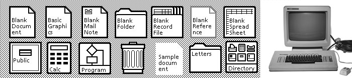
The Xerox Star is not particularly
well-remembered and it took the release of the Apple Lisa (above) in
1983 to make the use of icons as part of a GUI popular. The icons on
the Apple Lisa were near identical to those on the Xerox though some
of them were drawn with a little more attention to detail. The
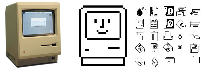
Macintosh followed in 1984 (below) and its icons were designed by the
legendary artist Susan Kare, who would go on to design the icons used
for Windows 3.1 in 1992. |
|
 |
|
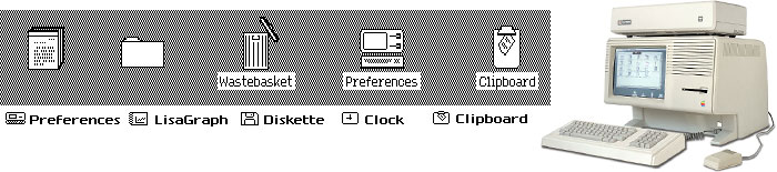
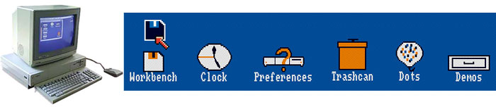
The first four colour icons appeared on
the Amiga 1000 in 1985 (below top). Apple rebooted the Macintosh in
1991 (below bottom left) and introduced colour icons and a
"raised" effect that showed clearly that the icons were
meant to be "clicked". In 2001 the Mac OS X (below bottom
center) came equipped with the most realistic icons ever seen and the
Microsoft Windows XP (below bottom right) featured icons that all use
a single light source with semi-transparent drop shadow. |
|
 |
|
 |
|
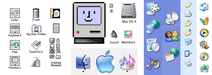
As computer icons
evolved they became less informative and more illustrative. They got
gelled, made 3D and grew in size thanks to modern screen resolutions
and then went flat again for no apparent reason. Many people (mostly
Mikey) were not satisfied with the icons being offered so they began
to create their own. Soon there were more icons available on-line
that you could ever possibly need or use and the last thing the world
needs is more icons. With that in mind we introduce our own set of My
Neat Stuff icons. It all started when Barney had created some folder
icons just for fun for use on our AV Club computers. People (except
Mikey) liked them and asked if they could have some. Why not? Now you
can download them here. The icons here are in the PNG format and can
be used in various dock programs available everywhere on the
interweb. For windows applications you will need to use ICO files.
Any of our PNG icons can be converted to ICO using off-line graphics
programs or one of these free online PNG to ICO convertors. |
|
|
|
|
|
|
|
To download a
PNG icon. Click on the icon you want to download. Right Click on the
image and a Context menu will pop up. From that menu choose "Save
link as..." and save the file to your computer. Our TV and
Movie Icons are sorted alphabetically in the folders below. The
"other" folder features program and windows icons. |
|
|
|
|
|